How To - Run a Heatmap Report
 Updated
by
Steve Corbesero
Updated
by
Steve Corbesero
To navigate to Heatmap reports, select the Area icon from the Application Navigation menu, and then select the appropriate Site and Area.
Running Heatmap Reports
A default Heatmap report will load with the data from the last week. To further customize the report, try altering the following:
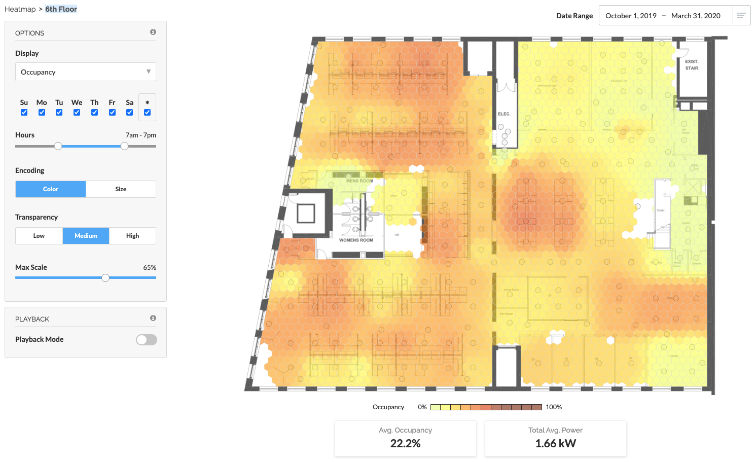
- Date Range: Enter a custom date range, or select from the drop-down menu
- Display: Select Occupancy or Average Power
- Days: Select / deselect days of the week
- Hours: Use the slider to choose a particular time range during the daily 24 hour period
- Encoding: Select Color or Size to change the encoding from color-based to size-based.
- Transparency: Adjust the transparency level for the heatmap tiles.
- Max Scale: If Color encoded, use the slider to compresses the color scale, which increases the contrast of the Heatmap.
- Color Palette Adjust: If Color encoded, hover over the legend and click the droplet icon to change color palette from Yellow/Red to Blue/Red.
Use the Max Scale adjustment to enhance subtle occupancy variations
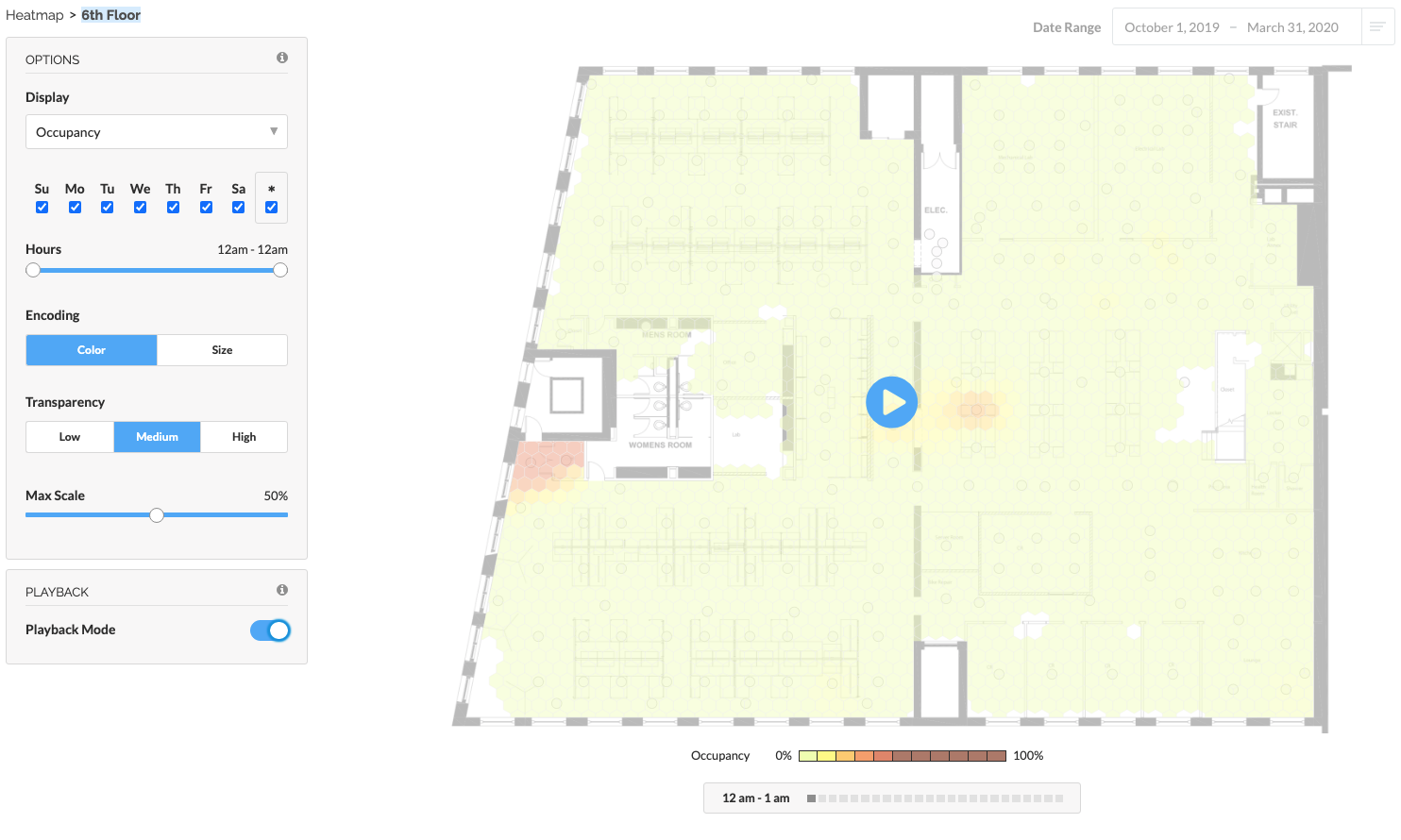
Using Playback Mode
- On the Playback card, enable Playback Mode
- Configure Date Range, Days, and Hours to your preference
- Click the Play button to begin the animation
[INSERT ANIMATION]
When in Playback Mode, options (other than date range) can be changed as long as the heatmap is not animating.
Tips & Tricks
- Set the date range for an extended period to understand average occupancy over the selected time. This is useful for understanding typical occupancy for a specific shift, particular weekday, or even a season.
- Use the heatmap to look at occupancy for a particular day or hour. Drag the Hours slider to see occupancy throughout the hours of the day for 24 hours.
- Running an occupancy heatmap report over time lets you see how employees or customers travel throughout the facility. You may be able to identify poor traffic patterns allowing you to improve productivity. You can also use the heatmap to layout your warehouse or production lines more effectively to reduce pick times or bottlenecks.
- Occupancy heatmap reports allow you to analyze the usage of space and see under-utilized areas.
- Use occupancy heatmaps for security information by identifying unwanted activities such as employees traveling in restricted areas or activity outside operating hours.
- The color slider is most useful when values aren't well-distributed; for example, a heatmap showing occupancy on the weekend might have all low values. In these cases, drag the color slider in from the edges to increase the contrast.